


Since its establishment in 2020, Coffilia has quickly distinguished itself within the vibrant landscape of the Vietnamese coffee market. Launched as a strategic initiative by the Minh Tien Coffee Group, which boasts over two decades of industry expertise, Coffilia encapsulates a unique blend of tradition and innovation. This venture aimed to introduce a retail sub-brand that not only upheld the group’s esteemed legacy but also resonated with the evolving preferences of a global audience.

The foundation of Coffilia is built upon the rich heritage of Vietnamese coffee culture, a domain in which the Minh Tien Coffee Group has long been immersed. With its roots in the cultivation and processing of coffee, the group set out to position Coffilia as a beacon of quality and innovation. The brand distinguishes itself by selecting the finest Arabica beans from Son La, creating a unique and unforgettable flavor profile that stands out in the competitive coffee scene.
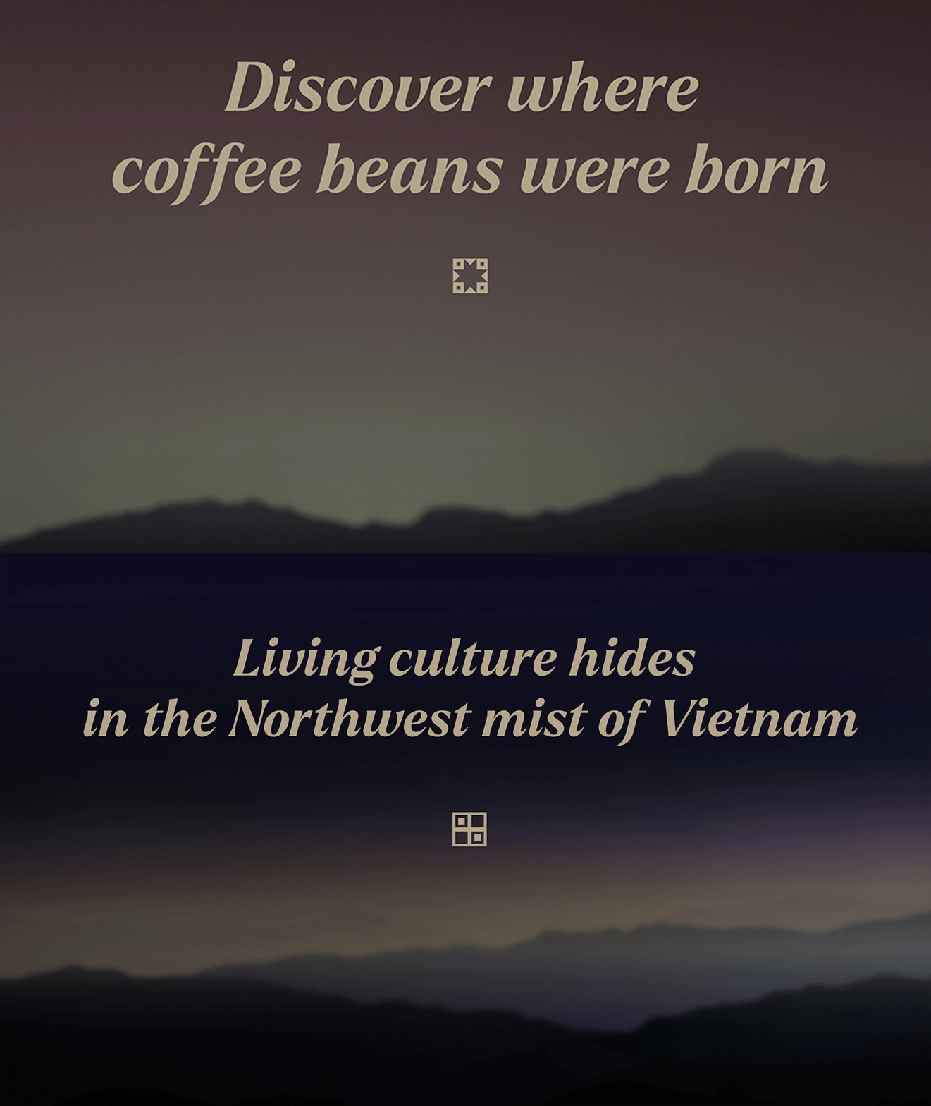
As it navigated the market dynamics, Coffilia encountered the challenge of carving out a new identity within a saturated industry, where the distinctiveness of a brand is as crucial as the quality of its products. Coffilia's strategic positioning sought to meld traditional values with modern aesthetics, appealing to a demographic that values authenticity as much as innovation.

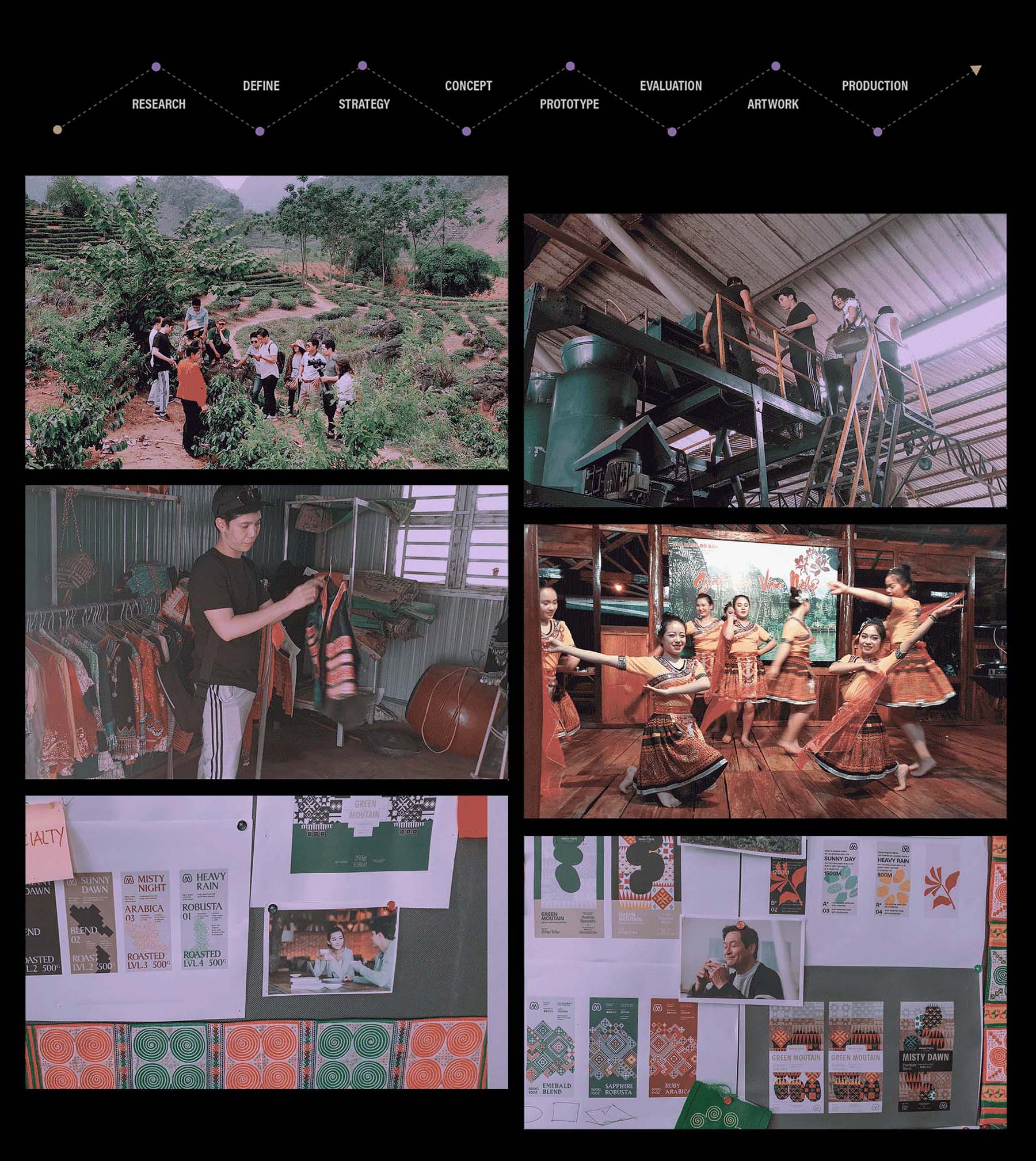
The visual identity strategy of Coffilia, developed in collaboration with Bratus branding agency, played a pivotal role in defining the brand’s ethos. This initiative was a dedicated effort to create a brand identity that reflects Coffilia's commitment to quality, heritage, and the sustainable practices central to Minh Tien Group's philosophy.
Key elements like the logo, typography, color palette, and patterns were carefully selected and crafted to reflect Coffilia's premium quality and its ties to Vietnamese coffee culture. This effort aimed to embody the brand's luxurious essence and its connection to Vietnam's rich coffee heritage.
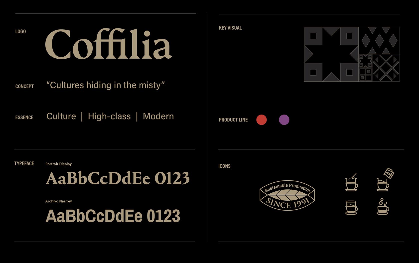
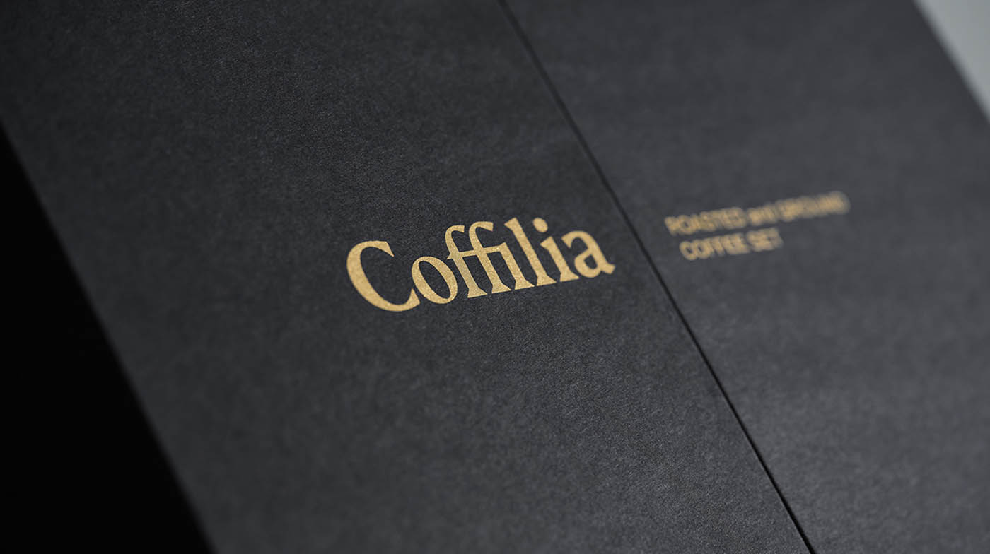
Central to Coffilia's visual identity is a logo that perfectly combines contemporary design with traditional elements, showcasing the brand's progressive approach and its deep roots in Vietnamese coffee culture. The choice of typography is critical, with Bratus selecting Portrait Bold by Berton Hasebe as Coffilia’s signature typeface. This selection embodies the brand's core, presenting a minimalist yet rich interpretation of French Renaissance styles. Portrait Bold blends classical elegance with geometric, triangular serifs, weaving a visual narrative that reflects Coffilia's mix of modern innovation and historical depth.
For broader brand communications and packaging, Coffilia pairs Portrait Bold with Archivo Narrow, a versatile sans serif by Omnibus-Type. This combination strengthens Coffilia's identity, symbolizing a fusion of sleek modernism with timeless heritage. These design elements collectively market the brand as a top supplier of premium, artisanal coffee, enhanced by a color palette of earthy tones and vibrant hues. This synergy ensures that Coffilia is seen as a brand that is both contemporary and deeply respectful of its origins.
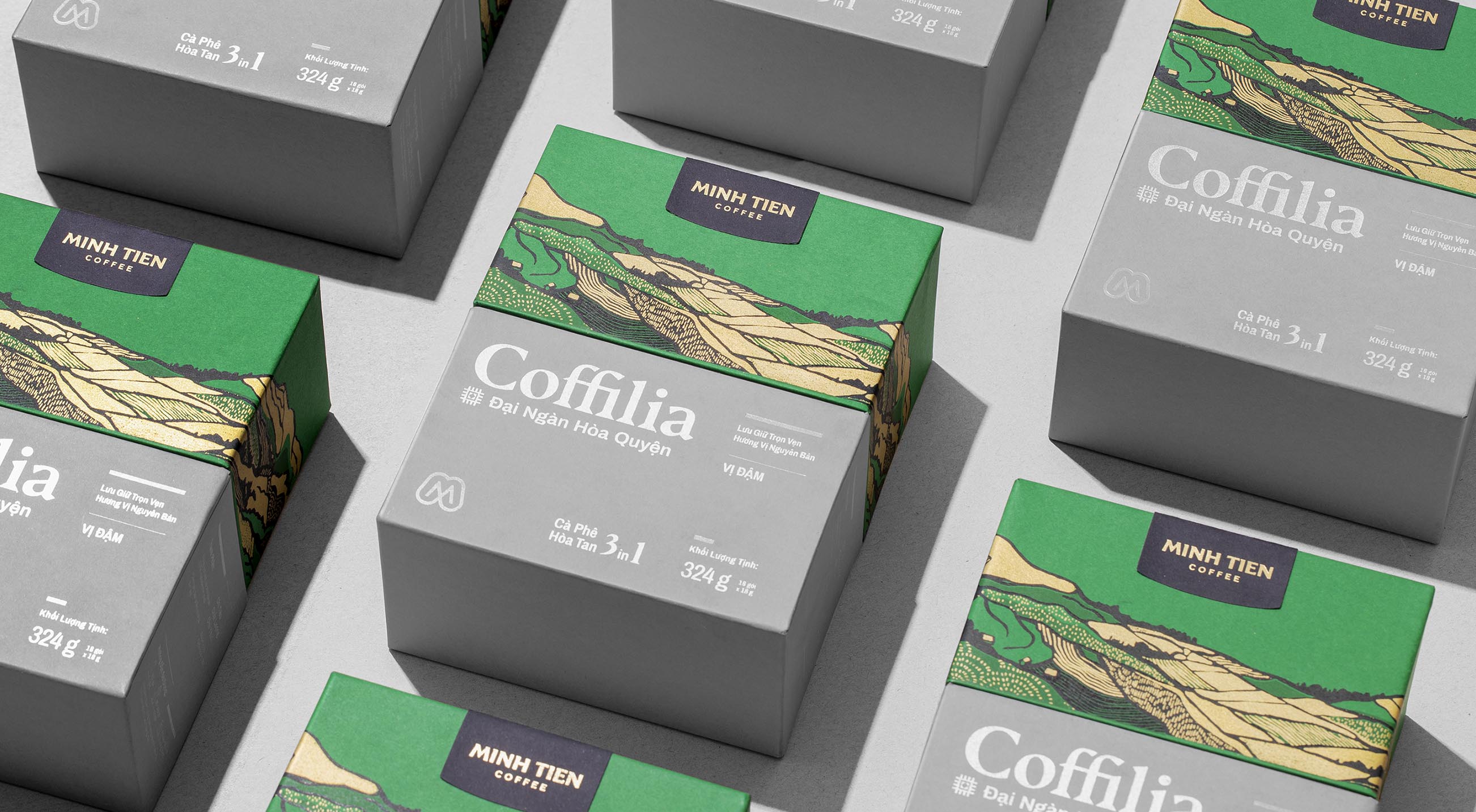
The development of Coffilia's initial packaging serves as a shining example of the brand's thematic focus, which Bratus realized with a deep appreciation for Vietnam's rich cultural heritage. The packaging skillfully utilizing geometric patterns, inspired by the textiles of ethnic groups from Vietnam's mountain regions, and watercolor illustrations of the mountains and coffee fields. This blend not only encapsulates Coffilia's narrative of "culture hiding in the misty" but also depicts the vibrant landscape that supports the brand's coffee. Incorporating these patterns and illustrations vividly brings Coffilia’s story to the forefront, encouraging consumers to explore the enchantment and beauty of Vietnam's coffee-producing regions.
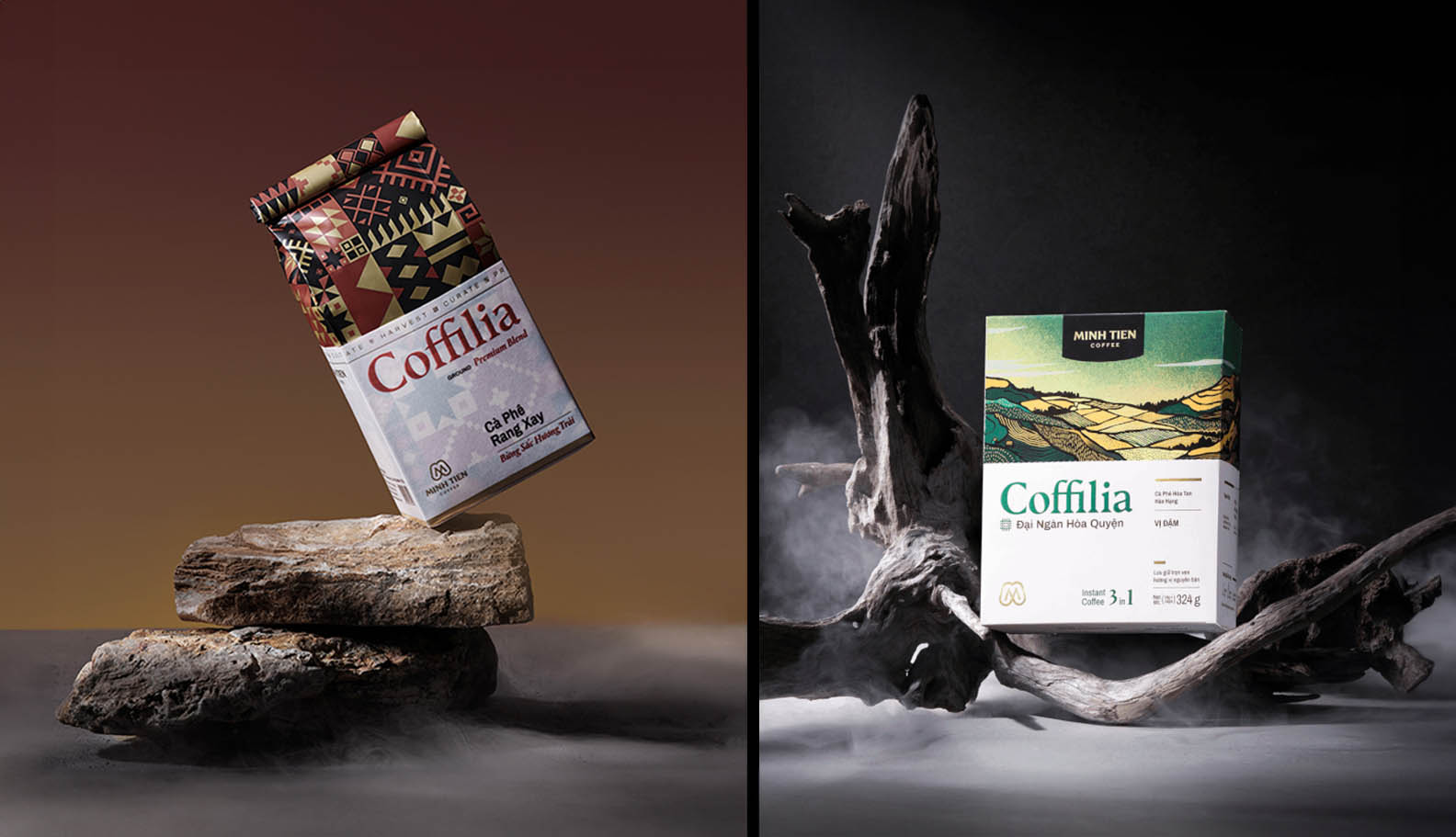
Additionally, the product photography, featuring fog and miniature mountains with rocks, is pivotal. It not only showcases the detailed design and overarching concept of "culture hiding in the misty" but also boosts the visual appeal of the products. This innovative photographic approach highlights Coffilia's premium status and its dedication to presenting the distinct cultural and natural influences on its brand identity.
Bratus' role in defining Coffilia's visual identity was instrumental in creating a comprehensive design system essential for the brand's growth. Through the design of a unique logo, the selection of harmonious typography, the integration of meaningful geometric patterns, and the leadership in art direction for illustrations, Bratus established a robust visual foundation. These elements merge to form a unified and impactful brand identity for Coffilia, ensuring consistency across future product lines and reinforcing the brand's core principles.

In conclusion, Coffilia stands as a significant leap forward for the Minh Tien Coffee Group, capturing the spirit of Vietnamese coffee culture in a manner that resonates with a global audience. With its meticulously crafted visual identity and strategic market positioning, Coffilia doesn’t merely redefine the coffee experience; it pioneers a new paradigm in integrating traditional values with contemporary brand storytelling, engaging consumers from every corner of the globe.


