Hangry Kitchen introduced the Len Com sub-brand X InSpace
Len Com
latest identity
IntroductionBrand StrategyVerbal IdentityVisual IdentityImplementationResults
About the case

Rice time! Let's take a break

Hangry Kitchen introduced the Len Com sub-brand X InSpace

Parent
Sub-brand
No items found.
No items found.
No items found.
Index
|
Curated By Brandcoat
Last updated on
July 17, 2024

Len Com is part of the Hangry Cloud Kitchen family, which has "kitchen" equipped to the same high standards as a four-star restaurant. With 9 unique tastes, Len Com provides excellent office meals to your desk, showcasing a wide range of Asian culinary traditions while remaining close to and acquainted with the normal street food approach. InSpace creative team lends a hand with logo dasign, label creation and further branded applications.

Lên Cơm logo
Lên Cơm logo

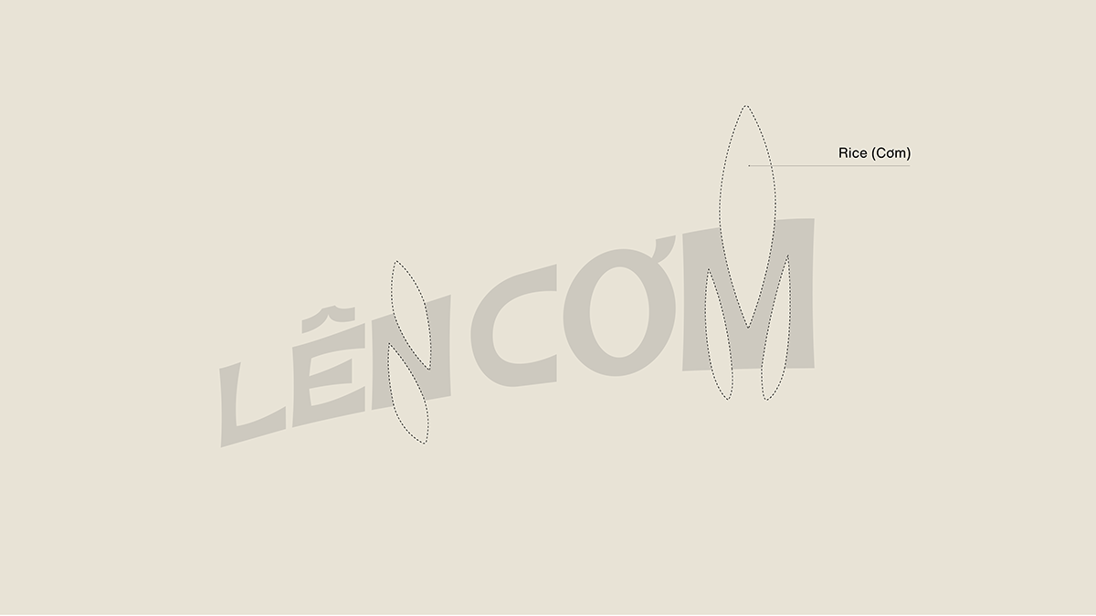
Design Concept: LenCom (Rice Up) logo is designed through inspiration from the image of the call, the call to eat at the restaurant in the daily culinary culture. The visual identity throughout is reflected in bold Asian tones and cuisine, with familiar sayings conveyed into the identity design language.​​​​​​​

Len Com case study on Behance

Lên Cơm logo fundamental idea

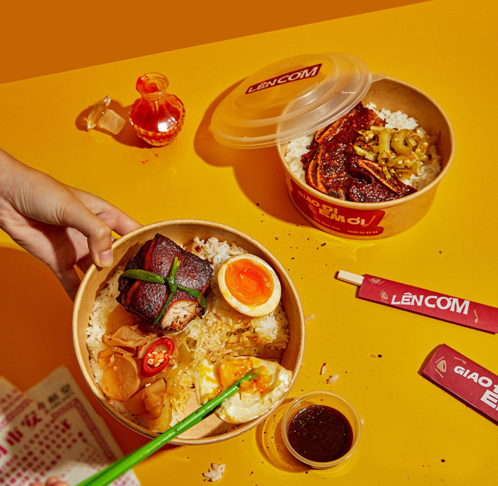
Lên Cơm packing and eating experience

Credits

Creative Director: Sanh Nguyen / Art Director: Nhi Tuong / Creative Designer: Trung Chau, Zahy / Animation: Zahy / Photographer: Vu Tran / Studio: 1990 Concept

tags
Dual
Wordmark
2020 Onward
One Signature
Warm Colors
Value Oriented
Generation Z
Len Com Brand Evolution
Thank you! Your submission has been received!
Oops! Something went wrong while submitting the form.
No items found.
Brand Portfolio and Hierarchy
Len Com's visual identity design awards
No items found.
Trademark
Len Com
Industry
Consumer Discretionary
Sub-Industry
No items found.
Founded year
2022
Entry to Vietnam
Origin country
Vietnam
Project context
Sub-branding
Release date
March 2009
Main colors
Branding Agency