Star of the Pharmaceutical Industry
STADA Vietnam relaunched as STELLA Pharma
Before
After

No items found.

No items found.
No items found.


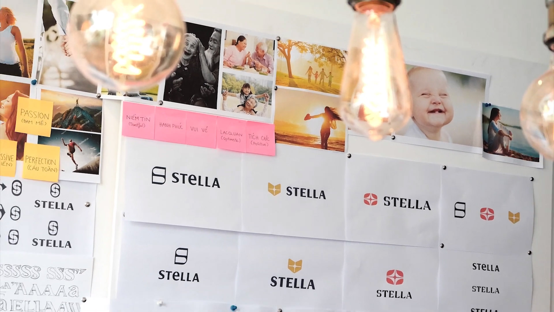
Originally launched in 2000 under the name STADA, the company has since formally relaunched as STELLA Pharma as of August 19, 2019. This new brand's basis, including its visual identity, packaging, and design, was built by Bratus in a collaborative effort. Stella is a major player in the Vietnamese pharmaceutical market and a reliable source of anti-viral medications. STELLA says that its prescription and over-the-counter medications are used by millions of patients in more than 50 countries throughout the world, with a particular emphasis on the treatment of cardiovascular illnesses, viruses, diabetes, and other metabolic disorders.
The new brand, which symbolizes "The Star of the Pharmaceutical Industry," represents the continuity of Stada Vietnam's achievements over the past two decades. The logo draws from several different symbols: the shield, for security; the heart, for emotion; the cross, for the medical field; and the star, for hope and faith. Stella Pharm's new logo represents the company's dedication to product quality and the entire meaning and principles that serve as a guide for all of the company's endeavors.

Bratus created a key visual system for 12 different medical categories, such as joints and bones, cells, microbes, the immune system, genetic chromosomes, neurological disorders, and the stomach. This abstract geometric language was based on the idea of human organ systems and drug treatment. This design system makes the packaging contents clearer and more consistent, which makes it easier for pharmacists to put things in groups and tell different doses apart.

We helped define the new packaging, forward-looking brand with research, science, technology at its heart, and the purpose of creating hope and a better future for people. The design uses an abstract visual to show the cure diseases process. Thus, that customers easily recognize the medicines, however, do not have negative feelings to use. All products are packed in bright, striking packaging, where each category has its color. The focus is on the ”human organ systems & transformation system” and is consistently displayed in various patterns to demonstrate the effect of the products visually.
Stella packaging refresh case study


