Nestlé Milo Vietnam latest logo and Visual identity X CBA Design Asia X The Circle
Milo
latest identity
IntroductionBrand StrategyVerbal IdentityVisual IdentityImplementationResults
About the case

A great Energy for Ever

Nestlé Milo Vietnam latest logo and Visual identity X CBA Design Asia X The Circle

Old
New
No items found.
No items found.
No items found.
Casefile (~4 Min)
|
Curated by Brandcoat
Last updated on
July 20, 2024

Milo, established in 1934, has gained global popularity and has notably thrived in Vietnam since its introduction in 1994. NESTLÉ® Milo is now a cherished chocolate malt beverage in Vietnam, enjoyed both hot and cold. The brand's expansion is underscored by strategic branding initiatives, including a global visual identity system and a 2020 packaging refresh by CBA Design, which was tailored for Vietnam by The Circle Branding team.

Nestlé Milo Vietnam latest logo and Visual identity X CBA Design Asia X The Circle

The name of NESTLÉ® Milo is inspired by the legendary Milo of Croton, an ancient Greek athlete renowned for his incredible strength, famously capable of carrying a bull across a stadium. This story represents the strength and stamina that NESTLÉ® Milo aims to promote among its consumers. In Vietnam and around the world, NESTLÉ® Milo is well-known for providing a balanced and nutritious start to the day, beloved by millions for its distinctive cocoa and malt barley flavor.
The brand's commitment to health is evident in its messaging—slogans like 'Champion made from Milo,' and 'Energize recess for an active day' are not just catchy phrases but affirmations of MILO®'s promise to deliver a robust foundation for an energetic lifestyle. This dedication to enriching lives is further exemplified in its straightforward tagline, which eschews complexity for clarity, ensuring MILO® remains a trusted and integral part of the daily routine for families everywhere.

Nestlé Milo Vietnam latest logo and Visual identity X CBA Design Asia

Milo's success in Vietnam can be largely attributed to its masterful brand positioning. It has established itself as a source of nutrition and energy, particularly for children. This positioning has helped Milo stand out against competitors by cultivating a unique identity that resonates with both the children who enjoy the beverage and the parents who purchase it. By highlighting its barley-based ingredients, Milo differentiates itself from the dairy-based products that dominate the market, offering a distinctive alternative that aligns with the local taste preferences.

The targeting strategy of Milo is as inclusive as it is specific. Aiming at children aged 6 to 14, a critical period for physical and mental development, Milo has positioned itself as an essential supplement to daily nutrition. Recognizing the active lifestyle of this age group and the limitations of daily meals in meeting their energy needs, Milo presents itself as a convenient and quick source of replenishment. Parents, the primary purchasers, have been assured of Milo's value, not only through product quality but also through strategic marketing that promotes children's participation in sports and physical activities.

Nestlé Milo Vietnam latest logo and Visual identity X CBA Design Asia X The Circle

Expanding its reach, Milo's product mix is vast and varied, comprising powders, drinks, cereals, and snacks. Each line is tailored to fulfill the diverse needs and preferences of its customers, offering different functions, quantities, and price points. For out-of-home consumption, Milo has adapted to include formats ranging from powder to liquid, easily utilized manually or via dispensers. This adaptability makes Milo an ideal choice across different settings, from quick service restaurants to convenience stores, echoing the brand's versatility and widespread appeal.

Nestlé Milo Vietnam latest logo and Visual identity X CBA Design Asia X The Circle

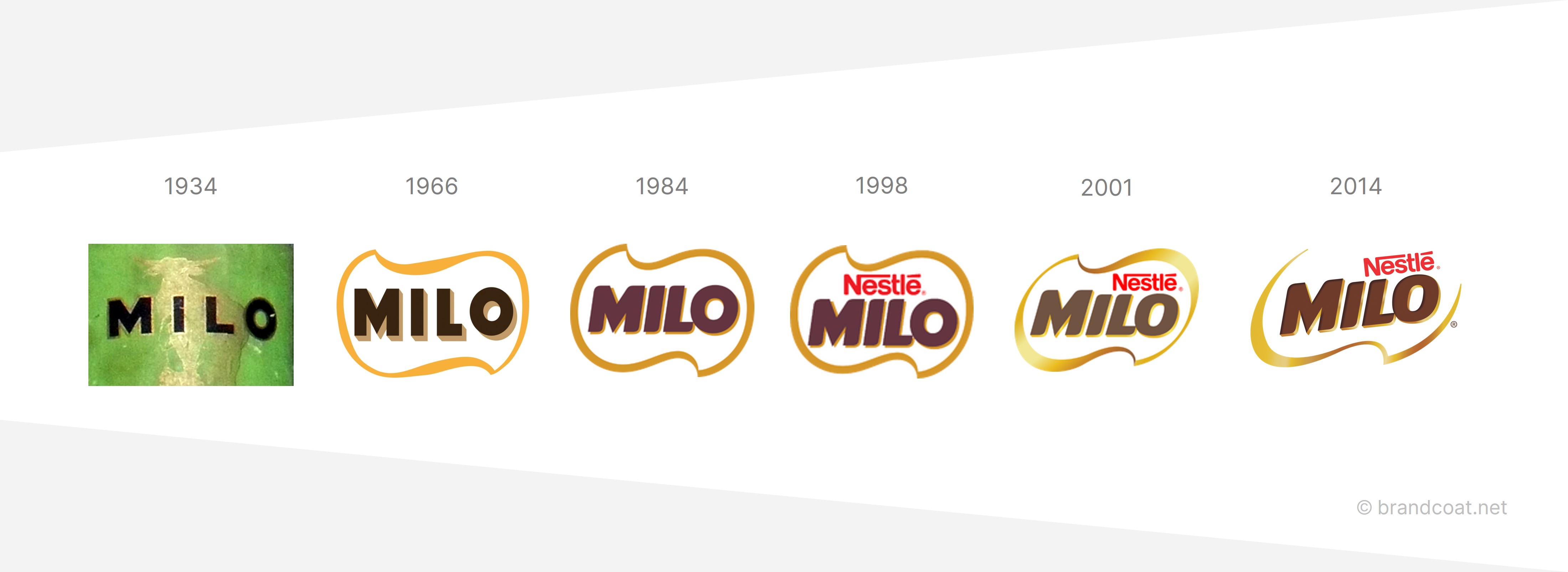
The brand's visual evolution is a testament to its commitment to inspiration and progress. The iconic Milo logo, while retaining its historical essence, has been invigorated with new meaning over the years. The green color, a hallmark of the brand, now signifies not just the beverage's natural ingredients but also the success and achievement of every finish line crossed, both metaphorically by the brand and literally by its consumers. The modernized global brand and packaging design, including the "Liquid Energy" motif, speak to Milo's unique position in the sports domain and its global identity.

Milo logo explain, logo meaning

Continuing with the brand's narrative, the CBA-led design uplift in 2019 was a pivotal moment for Milo. This refresh was more than a superficial facelift; it was a strategic overhaul aimed at enhancing the sensory appeal of the brand. The workshop conducted in Singapore had a clear mission: to redefine Milo's brand architecture and update its visual and sensory identity components. The result was a two-tiered design system catering to both mainstream offerings and product extensions like "Protein Up" or "Plant-Based." This evolution of the brand architecture not only improved product navigation and variant segmentation but also redefined the Milo benefit story through a more impactful Activ-Go device.

Nestlé Milo Vietnam latest logo and Visual identity X CBA Design Asia

Packaging design has always been a cornerstone of Milo's brand strategy. Throughout its iterations, the packaging has been thoughtfully designed to be not just aesthetically pleasing but also functional and environmentally considerate. The consistent use of the brand's signature green speaks to its natural ingredients and is instantly recognizable to consumers. The attention to sustainability is evident in the choice of packaging materials, with a focus on recyclability and environmental responsibility.

Milo Packaging history

Milo's marketing strategies have deftly navigated the Vietnamese market's complexities. By aligning with educational and sporting initiatives, Milo has expanded its influence beyond the supermarket shelves and into the community. Its support for sports equipment in schools and the organization of health-focused activities has been a smart move, allowing the brand to resonate with a broader audience and foster a culture of health and activity.

Nestlé Milo Vietnam latest logo and Visual identity

The brand's commitment to dynamic living is encapsulated in its taglines and campaigns, which have not only touched the hearts of consumers but also inspired a generation to move forward with vitality. The messaging is clear, and the intent is noble, creating a brand that is both a provider of nutrition and a symbol of the Vietnamese spirit of perseverance and unity.

Nestlé Milo Vietnam latest logo and Visual identity

In conclusion, Milo's journey in Vietnam is a remarkable example of a brand that has successfully adapted and grown in a foreign market. From its strategic positioning to its innovative marketing strategies and commitment to sustainability, Milo has demonstrated the power of a brand that truly understands and embraces the culture in which it operates. It has become more than a beverage; it is a brand that embodies the aspirations and dynamism of the Vietnamese people.

Nestlé Milo Vietnam latest logo and Visual identity

Credits

Global Brand Packaging Refresh: CBA Design

Milo Full Range Localized Packaging Design and Brand Development: The Circle - Branding Partners

tags
Rural
Emblem
Family Centered
Da Nang
Value Oriented
Urban
Southern Vietnam
Global
Ho Chi Minh City
Health Conscious
2019 and Earlier
Leading
B2C
English
One Signature
Generation Z
Metaphorical
Greek
Cool Colors
Milo Vietnam Brand Evolution
Thank you! Your submission has been received!
Oops! Something went wrong while submitting the form.
No items found.
Brand Portfolio and Hierarchy
Milo's visual identity design awards
No items found.
Trademark
Milo Vietnam
Industry
Consumer Staples
Sub-Industry
No items found.
Founded year
1994
Entry to Vietnam
1994
Origin country
Australia
Project context
Brand Refresh
Release date
March 2014
Main colors
Branding Agency
N/A